
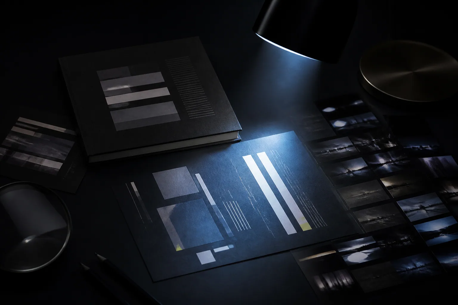
A story's visual identity speaks before its first sentence. Building dark atmosphere through colour, typography, light and space, from novel covers to digital interfaces. I am writing this record not simply to reach a conclusion, but to make visible the space the question opens in me. Instead of closing an idea too quickly, I follow how it appears in daily life, work and relationships. I want to leave an open table for thought rather than a final judgement. I therefore try to keep a distance between personal experience and a universal claim. I find value in an idea not when it offers the same answer to everyone, but when it opens new and honest questions inside different lives.
BEFORE THE FIRST SENTENCE
A reader sees the cover before reaching the first sentence; a visitor feels the rhythm of a page before reading its text. Colour, space, proportion and typography are the story's first promise. I see visual identity not as decoration added to a text but as its entrance. The door should not reveal the entire world inside, but it should establish the emotion with which we enter.
BLACK IS NOT ENOUGH. Dark design is not merely the use of black. Black supplies a ground; atmosphere is built by the position of light, the texture of surfaces and the distance between colours. If everything is dark, nothing feels dark. A blue reflection, warm paper tone or single bright letter gains meaning through the space around it. Darkness is really a decision about how carefully light is used.
THE VOICE OF TYPE. A typeface does more than provide readability; it determines the voice of the text. Geometry can sound technological and distant, a serif can carry history and literary weight, and monospaced letters can suggest a system. Strong design does not raise every voice at once. It chooses one primary voice and lets the others support it. Premium appearance is usually born from clearer hierarchy, not more elements.
In a dark design, black is not empty space; it is an active surface that changes the behaviour of every other colour. The same red that signals a warning on white can look like a wound on black. Blue may cease to suggest daylight and become a cold window opening into night. Building a dark atmosphere therefore does not mean reducing colour but recalibrating the psychological distance between colours. We decide where the eye can breathe, where it will be drawn and what will only be sensed. The strongest darkness does not hide everything; it reveals what we want to see a little later than expected.
This is why I do not associate darkness in Mavi's visual world only with murder. Real darkness begins when a person can no longer trust what they see. Is it a reflection or a face, a memory or a ghost, evidence or an image produced by guilt? Design should not explain this uncertainty; it should carry it. An image that is too clear consumes the mystery, while one that is completely closed cannot connect with the reader. The right balance makes the question visible without displaying the answer. A good cover or interface does not summarise the story. It opens a dark room in the reader's mind where the story can begin.
SPACE IS A MATERIAL
I do not treat empty space as a gap waiting to be filled. It is where the eye pauses and meaning echoes. In a dark interface, density destroys atmosphere. Controlled margins, smaller headings and clear alignments give content confidence. Importance does not always require enlargement; sometimes isolation is enough.
PARTS OF THE SAME WORLD. A book cover, social image, website and photographic language should not repeat one another even when they belong to the same story. Each has a different task but carries the same atmosphere. In this site's design, system lines meet the feel of paper, cold blue light meets human stories, and order meets uncertainty. Designing darkness is the art of revealing the right thing as much as concealing it.
Typography is the voice of that atmosphere. A sharp sans serif can give a text mechanical tension, while a thin and fragile serif may create a whisper from the past. Letters are not merely read; they are felt through weight, spacing and their loneliness on the page. Making a title larger does not always make a book cover stronger. Sometimes a small word speaks louder because of the vast silence around it. The designer is not decorating here but acting as a narrator who adjusts the level of silence. Every visual decision determines how much of the story is spoken now and how much must wait.
The attraction of darkness does not come only from fear; it comes from the freedom to place our own meaning inside the unknown. When the eye cannot select every detail, the mind completes the missing parts and often produces an image more personal than anything a designer could show. Working with darkness therefore requires trust in the viewer. Instead of explaining everything, we leave room for experience. Yet that room is not uncontrolled. The direction of light, the limit of contrast and the single visible detail quietly guide the path imagination will take. Successful dark design can create the feeling of being lost without losing the user. This is where literature and visual design meet: both leave signs to be completed within the reader or viewer rather than directly describing the unseen. Darkness ceases to be a colour preference and becomes a co-author of the narrative.
READER SIGNAL
Leave a sentence on this file.
Your signal passes a digital check before entering the archive.